
Calm Color Schemes: Transform Your Home Into a Serene Sanctuary in 2025

Are you tired of chaotic, stressful living spaces that drain your energy? Welcome to the transformative world of calm color schemes! In our fast-paced modern lives, creating a peaceful home environment isn’t just a luxury—it’s a necessity for mental wellness.
Color psychology reveals that our surroundings dramatically impact our emotional state. Certain hues can literally reduce stress, enhance productivity, and create a sense of tranquility. We’ll explore how strategic color selection can turn your home into a sanctuary of calm.
Understanding Color Psychology in Home Design
Color isn’t just visual—it’s emotional! Neuroscientific research shows that specific color wavelengths trigger different psychological responses. Soft blues, gentle greens, and warm neutrals can lower cortisol levels and promote relaxation.
The Science Behind Soothing Colors
- Blue Tones: Scientifically proven to lower blood pressure and heart rate
- Green Shades: Evoke feelings of natural harmony and balance
- Neutral Palettes: Create visual breathing room and reduce mental clutter
Pro Tip: Color Intensity Matters
Not all colors are created equal! Soft, muted tones create more relaxation compared to bright, saturated colors. Think whisper-soft sage instead of electric green.
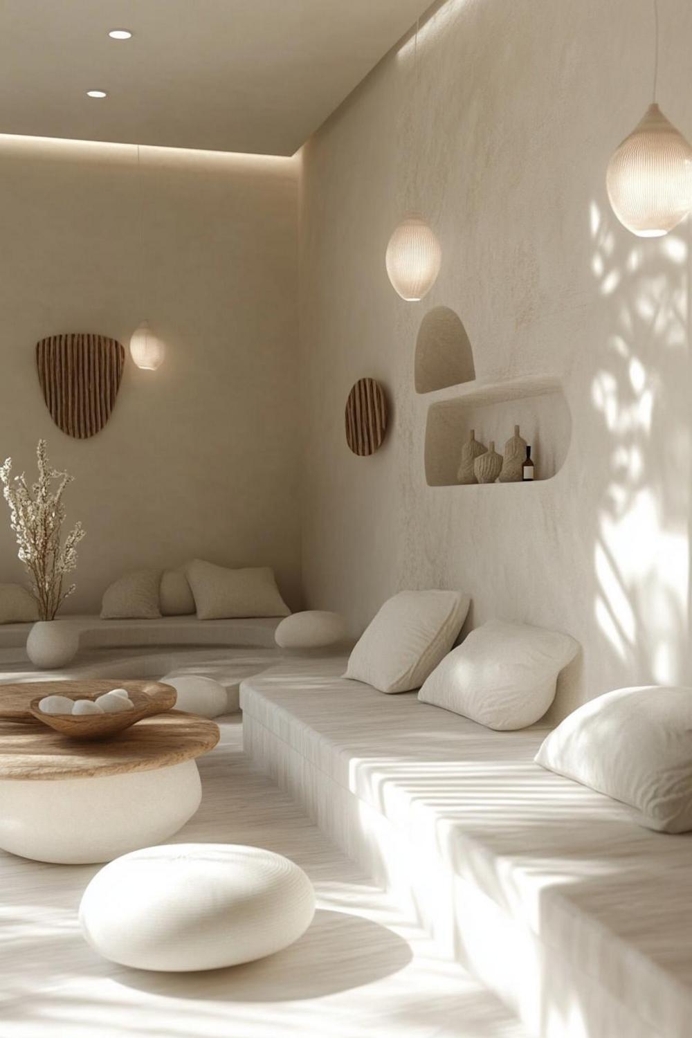
Designing Calm Color Schemes: Practical Strategies
Creating a serene color palette requires thoughtful planning. We recommend a holistic approach that considers room function, natural light, and personal emotional responses.
Selecting Your Calm Color Palette
Start by identifying rooms that need the most stress reduction. Home offices, bedrooms, and living areas benefit most from calm color schemes. Consider these professional designer strategies:
- Use a maximum of 3-4 colors in your palette
- Prioritize soft, natural tones
- Layer textures within your color scheme
- Consider room lighting and natural sunlight
Room-by-Room Color Recommendations
Different spaces require nuanced color approaches. Here’s a quick guide to creating tranquility in key areas:
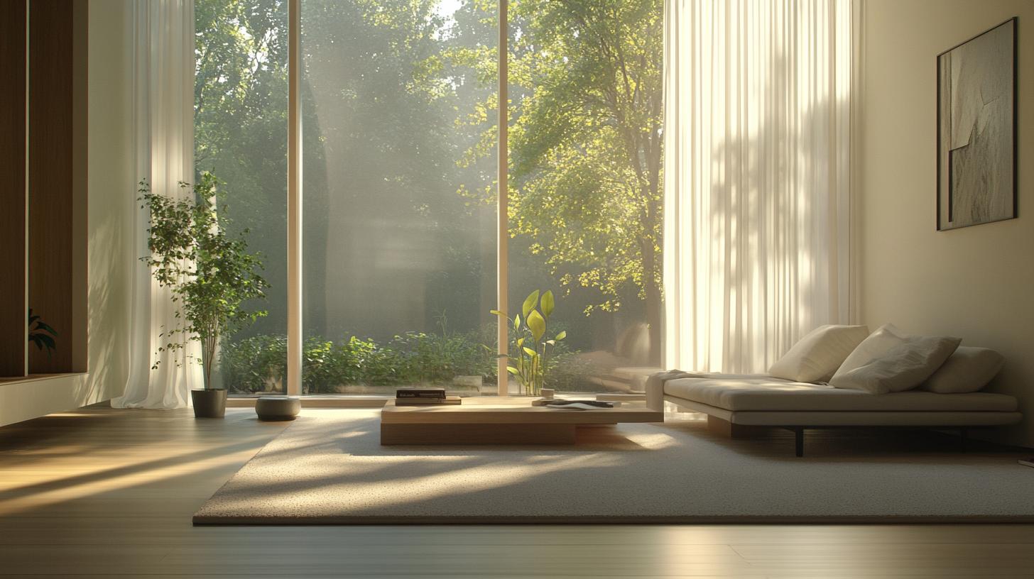
Bedroom Calm Palette
Focus on soft blues, lavenders, and warm grays. These colors promote relaxation and improve sleep quality. Avoid stimulating reds or bright oranges that might disrupt rest.
Home Office Zen Design
Choose muted greens and soft blues to enhance focus and reduce mental fatigue. Incorporate natural wood tones to ground the space and create a sense of stability.
Implementing Your Calm Color Scheme
Remember, creating a peaceful environment is an ongoing journey. Start small, experiment with color samples, and don’t be afraid to adjust your palette as you learn what truly brings you peace.
Pro Tips for Color Harmony: • Use color swatches and test in different lighting • Consider emotional responses to specific shades • Layer textures to add depth to your color scheme
By understanding and intentionally designing with calm color schemes, you’re not just decorating—you’re crafting a holistic environment that supports your mental and emotional well-being.


