
Scandinavian Color Schemes: Refresh Your Home in 2025

Scandinavian color schemes represent more than just a design trend—they’re a sophisticated approach to creating harmonious, serene living spaces. Born from the Nordic regions’ unique landscape and cultural aesthetic, these color palettes blend functionality with understated elegance. Designers and homeowners alike are increasingly drawn to these refined color strategies that transform ordinary rooms into extraordinary experiences!
Understanding Scandinavian Color Foundations
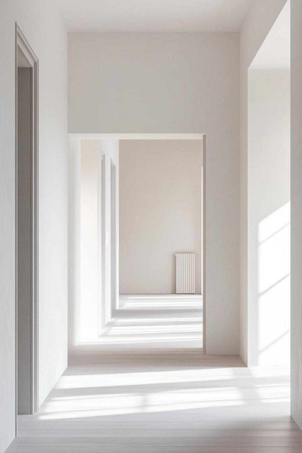
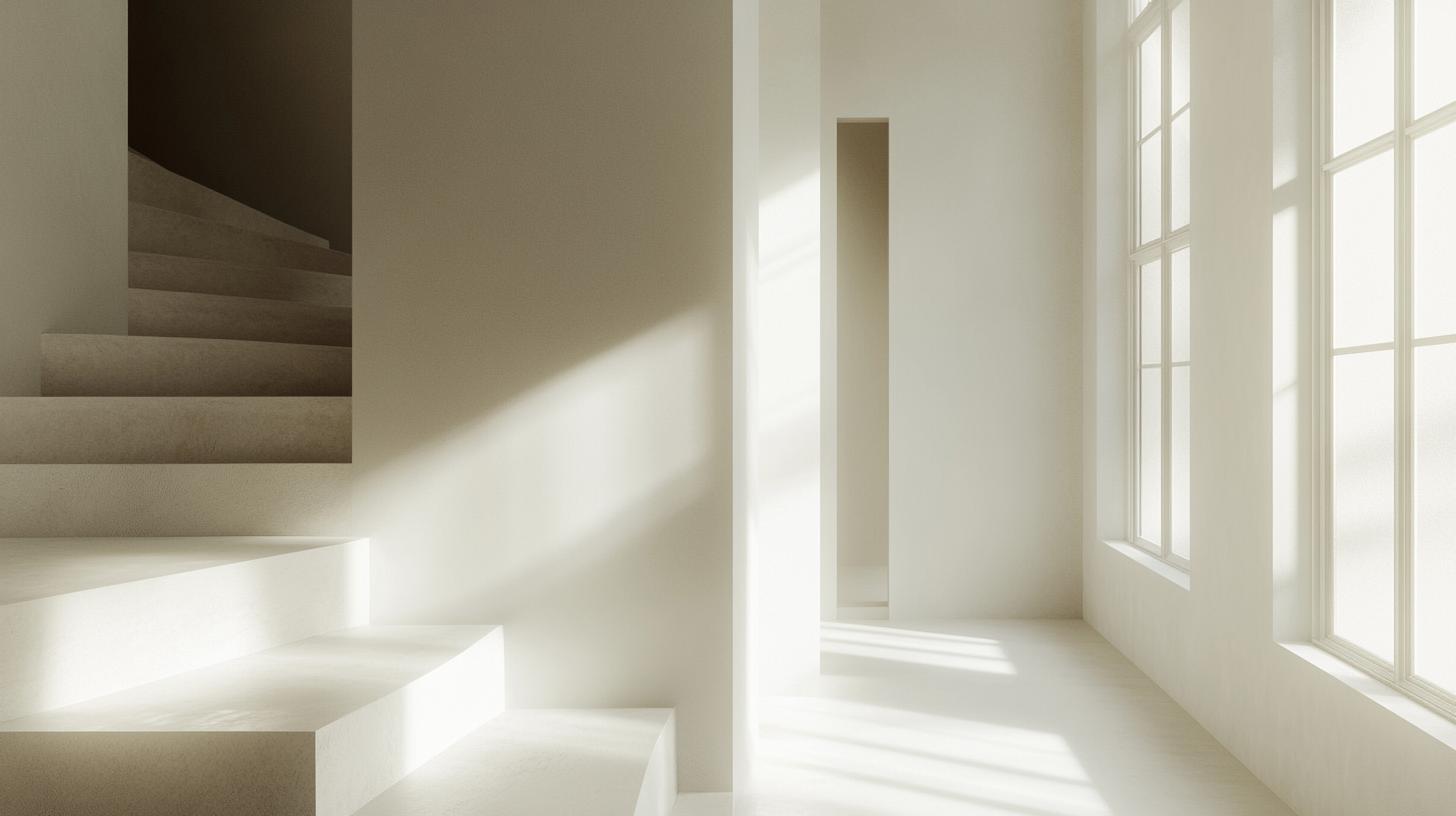
At the heart of Scandinavian color design lies a profound respect for natural light and minimalist principles. The color schemes typically emphasize:
- Soft, muted neutral tones
- Subtle earth-inspired hues
- Strategic use of white and gray as primary backdrops
- Occasional pops of muted pastels
The Psychological Impact of Nordic Color Choices
Nordic color philosophy goes beyond visual appeal—it’s about creating environments that promote emotional well-being. By selecting colors that reflect natural landscapes, Scandinavian designers craft spaces that feel simultaneously calming and invigorating.
Key Color Temperature Considerations
When selecting Scandinavian-inspired colors, consider temperature nuances. Warm grays with subtle undertones can make spaces feel more inviting, while cooler shades maintain that signature Nordic crispness.
Implementing Scandinavian Color Schemes in Modern Homes
Translating Nordic color principles into your living space requires strategic thinking. We recommend a layered approach that builds complexity through thoughtful color selection and textural elements.
Recommended Color Palette Strategies
- Start with a white or light gray base
- Introduce subtle earth tones like sage green and warm taupe
- Incorporate textural elements in complementary neutral shades
- Use minimal accent colors sparingly
Practical Application Tips
Pro Design Tip: Balance is crucial in Scandinavian color schemes. Aim for 70% neutral tones, 20% complementary shades, and 10% intentional accent colors to maintain visual harmony.
Seasonal Color Adaptations
One fascinating aspect of Scandinavian design is its ability to adapt subtly with seasonal shifts. During winter months, incorporate slightly warmer undertones to counterbalance the natural light reduction.
By embracing these nuanced color strategies, you’ll create living spaces that feel simultaneously timeless and contemporary—a hallmark of true Scandinavian design excellence!

